

Costa Dulce Panaderia
Inspired by the familiarity of traditional Mexican bakeries, Costa Dulce adds a coastal twist that brings a fresh yet comforting experience. It’s a place where community thrives, memories are made, and the taste of home is always just a bite away.
With pan dulce infused with tropical notes, our baked goods bring the warmth of the coast to your table.
-
Nestled along the vibrant coastline of Mexico, Costa Dulce Panadería is more than a bakery. Inspired by the serene vibes of Mexico’s shoreline, the goal was to create a logo, visual language, and design a brand identity that invites people to gather, share stories, and savor ocean-inspired baked goods in a warm, welcoming atmosphere.
-
Inspired by the ocean, using the ocean and sand for the color palette. alongside icons that look like traditional baked goods part of the design system.
-
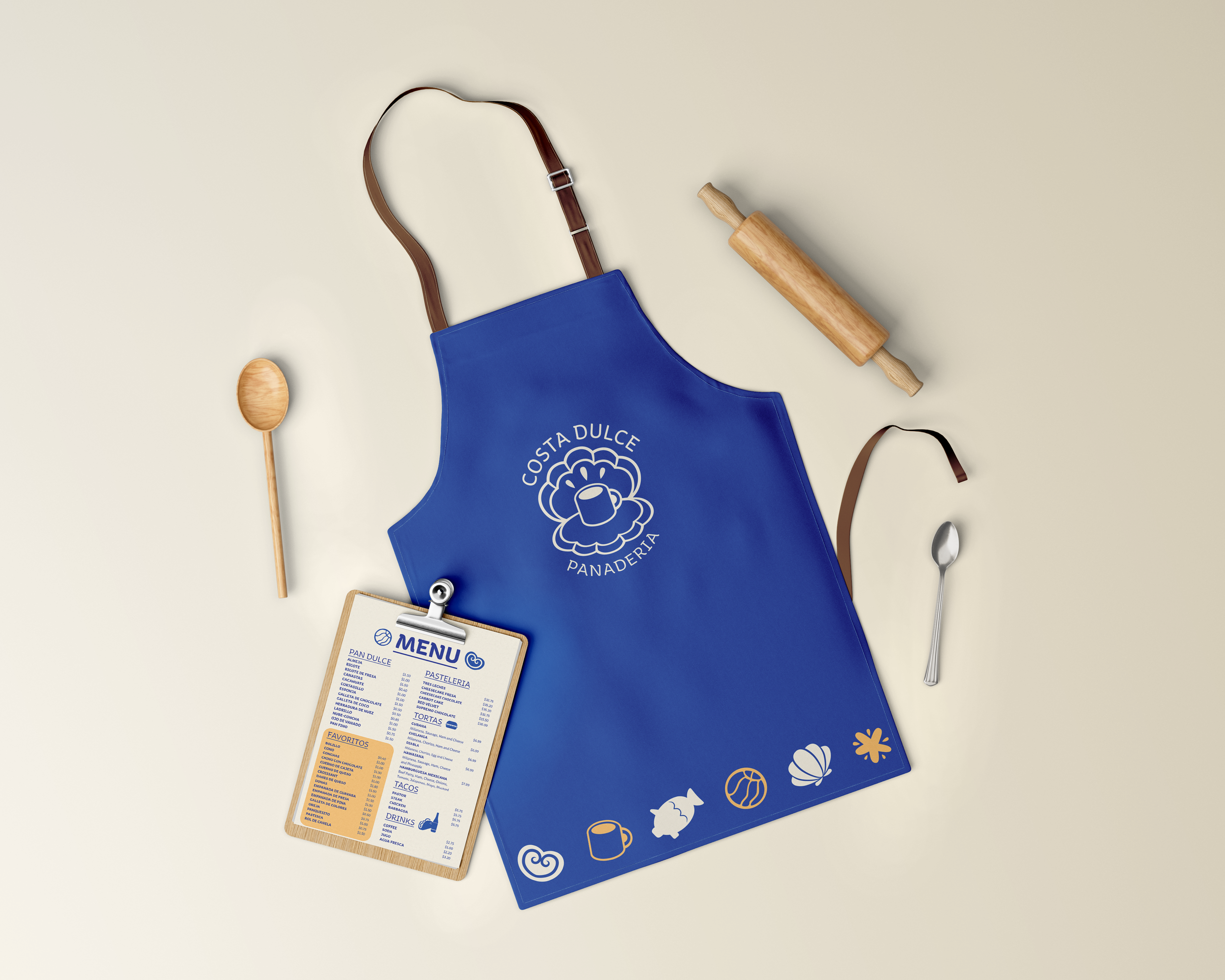
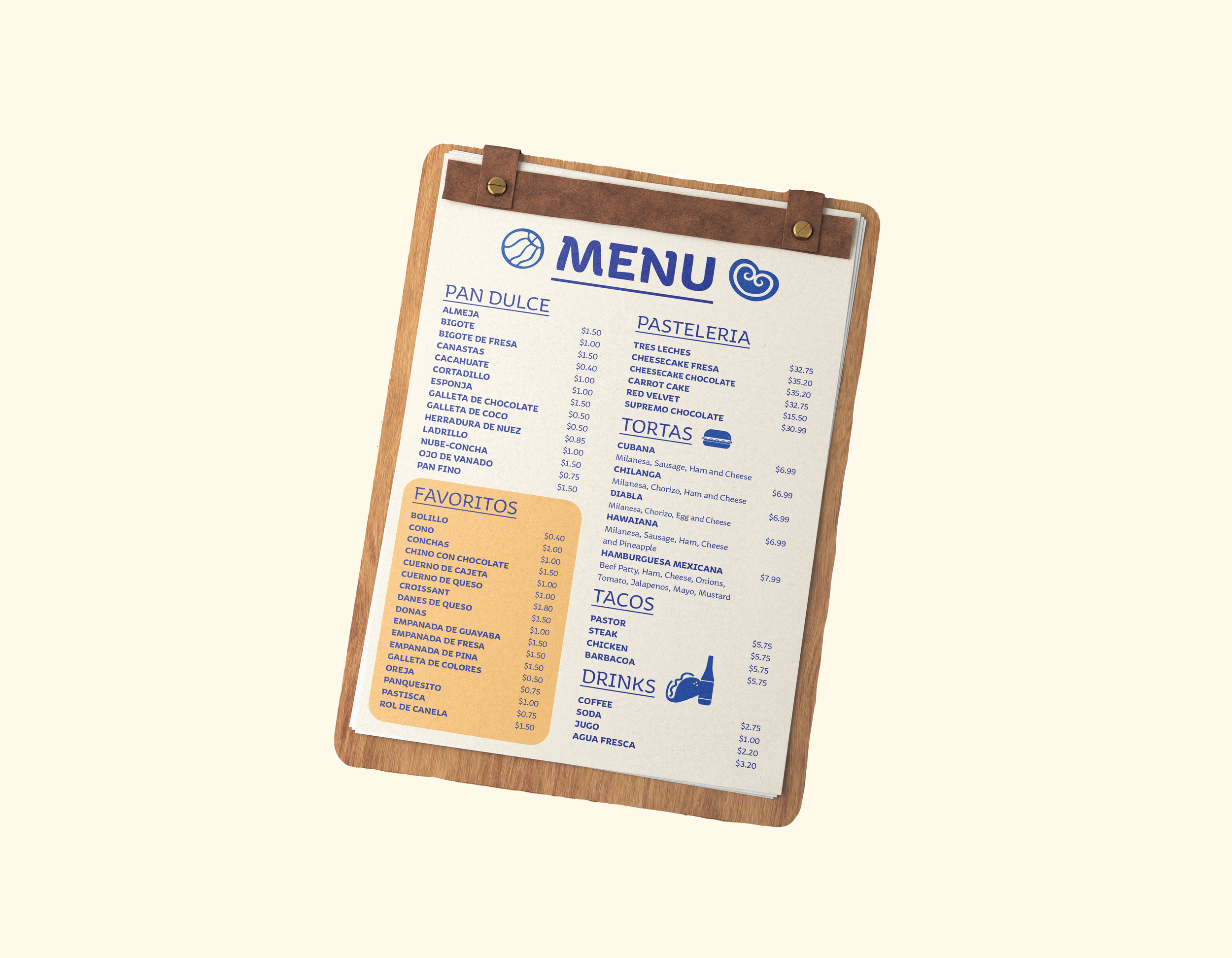
Brand Identity System, Custom Icons, Branded Cookware, Brand Guidelines, Print design, Flyers
-
Costa Dulce Panadería is designed to attract Latinos who cherish the joy of gathering with family and friends to share good food and meaningful conversations.
Discovery
To explore the visual direction for Costa Dulce Panadería, I created three mood boards that capture the essence of a coastal-inspired Mexican bakery. The first mood board highlights the warmth and familiarity of traditional panaderías, blending iconic Mexican pastries with hints of seaside charm through rustic bread and talavera patterns.
The second board introduces a modern coastal feel, with pastel colors, playful seashell motifs, and minimalist branding concepts that evoke the lightness of a beach town bakery.
Finally, the third mood board embraces a whimsical and nautical approach, featuring ocean-themed pastries shaped like fish, octopuses, and turtles—infusing playfulness and cultural vibrancy. Together, these mood boards lay the foundation for a brand that is both nostalgic and innovative, rooted in tradition yet fresh with coastal inspiration.


Sketch Process
During the sketch phase, I explored various concepts that blend the essence of Mexican coastal life with traditional bakery elements. My sketches feature a range of bread-inspired sea creatures like turtles, dolphins, and playful fish, each designed to reflect the spirit of Mexico's shorelines.
To deepen the cultural connection, I experimented with integrating traditional Talavera patterns—iconic in Mexican pottery and tilework—into the designs, adding intricate details and vibrant flair. This phase allowed me to experiment with form, pattern, and symbolism, aiming to create a logo that is both culturally rich and visually inviting.


Logo Drafts
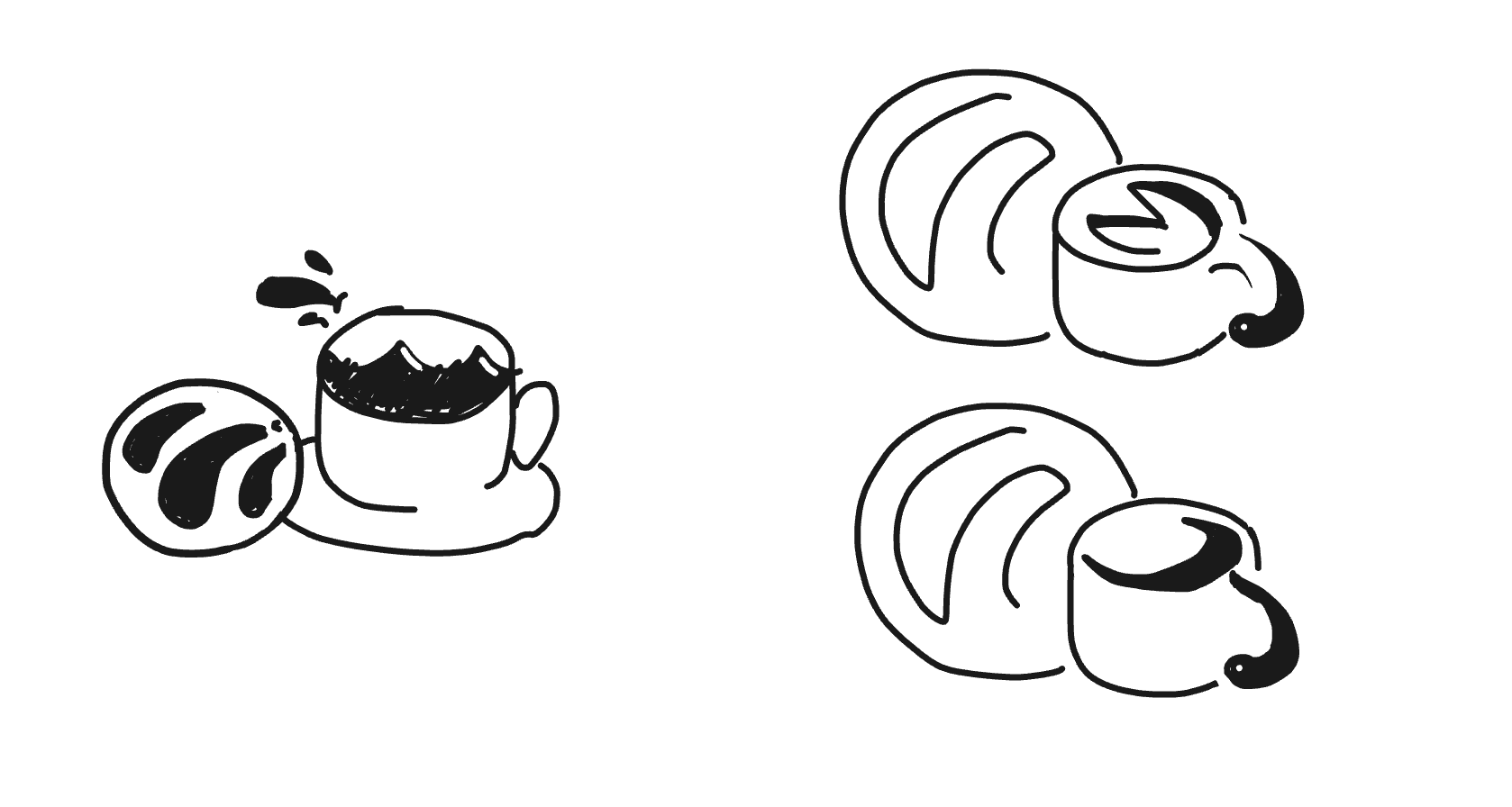
In the logo drafting phase for Costa Dulce Panadería, the design underwent significant evolution through multiple iterations. It began with concepts like an ocean swirling inside a coffee cup, a concha detailed with fine lines, and a version where the concha was paired with a fish serving as the mug’s handle. I also experimented with fish-shaped bread designs to further explore the ocean-meets-bakery theme.
From there, I refined the concept, simplifying the concha and fish handle while making subtle adjustments to create a clearer, more impactful visual. After receiving feedback, I recognized the need to rethink the design approach, focusing on how the logo would be perceived at a glance and ensuring its message was instantly recognizable.

Round 1


Round 2

Round 3
Step Back
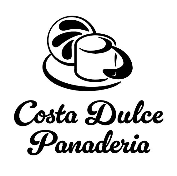
After receiving feedback, I took the opportunity to reassess my logo design and revisit some of my original sketches for inspiration. Initially, I considered using a concha to represent the bakery, as it's an iconic symbol of Mexican pastries. However, I realized it was a bit too on-the-nose. Instead, I opted for a seashell to play off the fact that "concha" also means seashell in Spanish.
This choice allowed me to create a unique form that still hints at the bakery's roots while introducing the coastal theme. At the center of the shell, I integrated a coffee cup to clearly communicate the bakery's atmosphere, inviting people to gather, sip, and savor. I also refined the typography, choosing a minimalist font with consistent stroke weight to match the clean, balanced feel of the new logo.
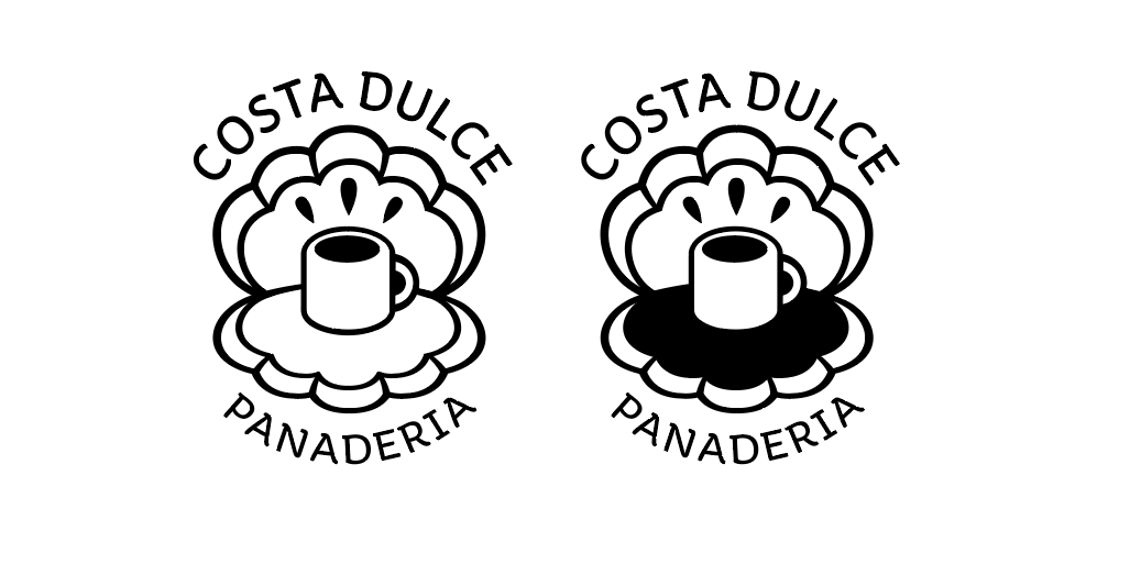
Final Logo Design
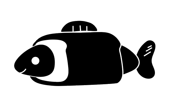
In the final phase of the Costa Dulce Panadería logo design, I revisited my sketches with a fresh perspective. Realizing that the fish motif could unintentionally suggest a connection to seafood, I shifted the concept to something more fitting: a sea shell.
This new approach allowed me to encapsulate the ocean theme while maintaining clarity about the bakery's purpose. To create a strong focal point, I placed a coffee cup at the center of the shell, symbolizing warmth and familiarity. This design choice effectively communicates the idea of an ocean-inspired bakery, making it instantly recognizable and inviting to the target audience.

Mockups


This project was both a deeply personal and creatively challenging experience. From the beginning, I had a clear vision of who I wanted to reach an audience like my mom, who love to get delicious pan dulce and coffee to her local panaderia. I wanted to reimagine that experience with a modern twist, shaping the familiar breads into playful sea creatures and crafting an inviting atmosphere where friends and family could gather and relax.
This vision pushed me to go beyond the typical bakery aesthetic and explore a concept that fused tradition with coastal inspiration. Despite my strong connection to the culture and initial research, the biggest challenge was stepping back and seeing the bigger picture. It was only after that pause that I could realign my design, creating a logo that was both clear and instantly recognizable. This journey taught me the value of perspective, and the importance of balancing personal connection with clear visual communication.