
Gentle Bark Cold Brew
Gentle Bark is a cold brew brand created for young adults who want to break away from overpriced coffee chains, and take a more cost-effective approach to their daily caffeine fix.
Drinking this coffee brings the bark in your morning! Perfect for those who value quality in their coffee beans. Many enjoy slower mornings and appreciate the simple joys of life, from great brews to loyal companions.
-
Create brand, packaging and social media to connect with customers.
-
The company offers a charming, approachable design that feels personal and fun by using soft colors and cute illustrations in the brand guidelines
Creating bottle labels and packaging for different flavors, then extended the branding across social media, billboards, and posters.
-
Branding, Custom Illustration, Social Media, Content, Merchandise, POS, Campaign, Brand Guidelines, Graphic Design, Packaging, 3D modeling.
-
The target audience is made up of people in their 20s or so. Aware of how and where they spend their money. However, they still love to have fun going out, and love trying new types of coffee, and appreciate a calm, relaxing environment while they sip their brew. Most of them are pet lovers too, often enjoying their mornings with a furry friend by their side.
Research
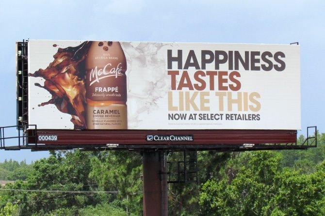
During the research phase, I visited both H-E-B and Central Market—two stores owned by the same company but catering to slightly different audiences. Central Market is known for its upscale presentation and focus on premium, curated products, while H-E-B appeals to a broader, more everyday shopper.
Observing how some brands appear in both locations helped me better understand how a product like Gentle Bark could bridge that gap: appealing to young adults who value quality and aesthetics, but who are also mindful of cost. This informed the brand’s direction and supported its key message—to offer thoughtfully crafted coffee in a calm, approachable design for those who want a premium experience without the premium price tag.


Discovery
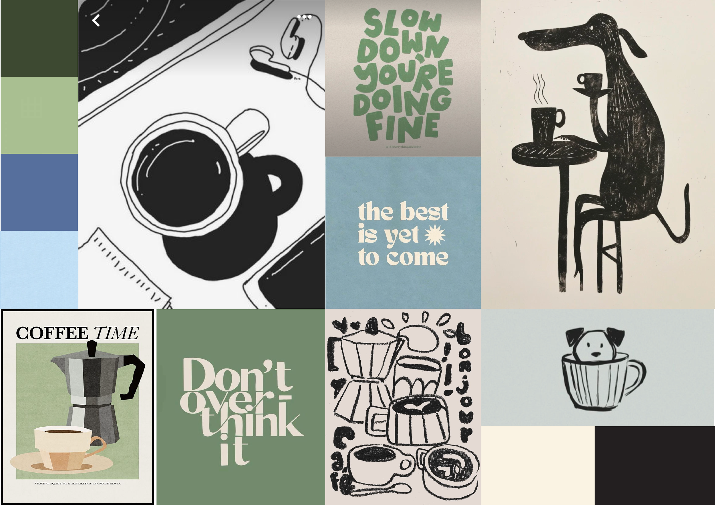
The mood board for Gentle Bark sets a calm, inviting tone through a soft pastel palette of greens and blues, evoking a sense of ease and relaxation. Hand-drawn black ink sketches of dogs sipping coffee or curled up in cups add a personal, gentle touch that brings warmth and character to the brand.
Together, these elements create a soothing visual language that reflects Gentle Bark’s mission: to offer a cozy, cost-effective coffee experience that feels just as good as it tastes.
Sketch Process
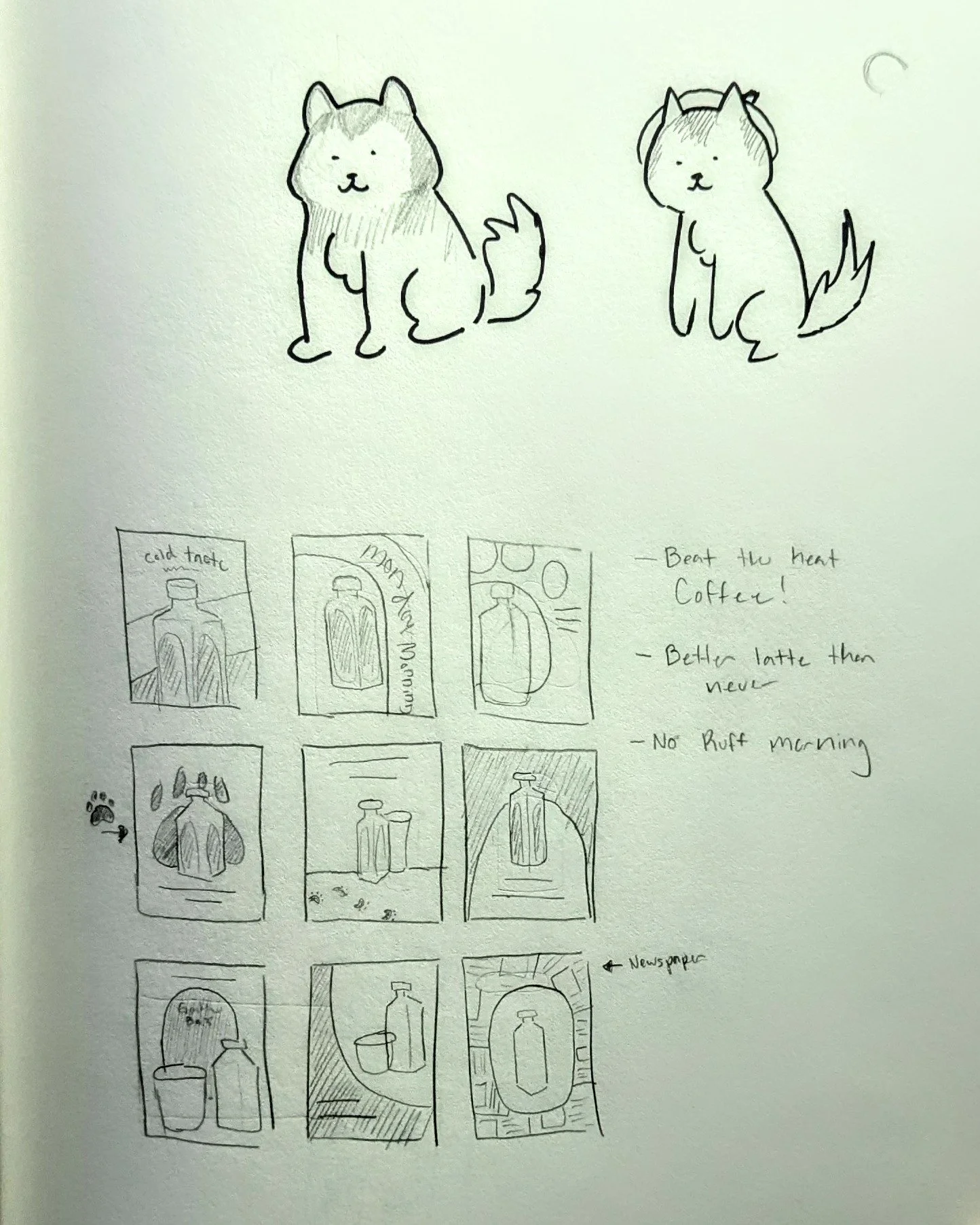
During the sketch process, I explored various dog breeds and label designs. A suggestion that was given to me by someone told me to draw huskies because they live in cold climates.
And with that, I experimented with many styles, which became a focal point of the concept. Additionally, I developed poster layouts to complement the designs.


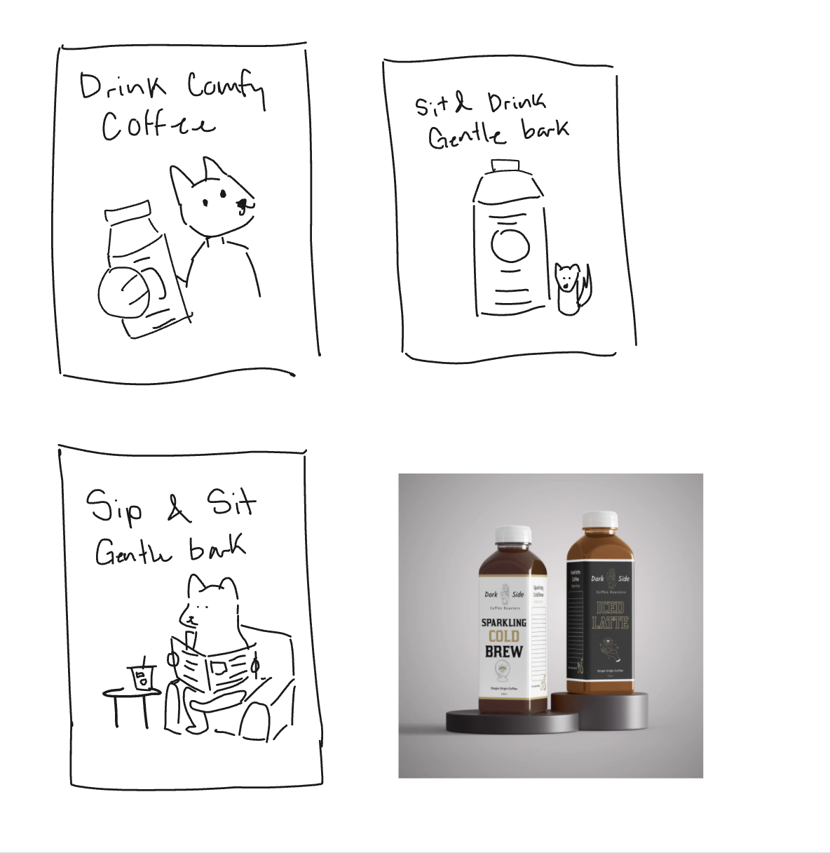

Label Drafts
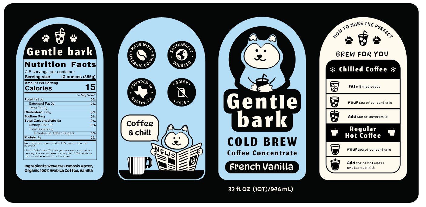
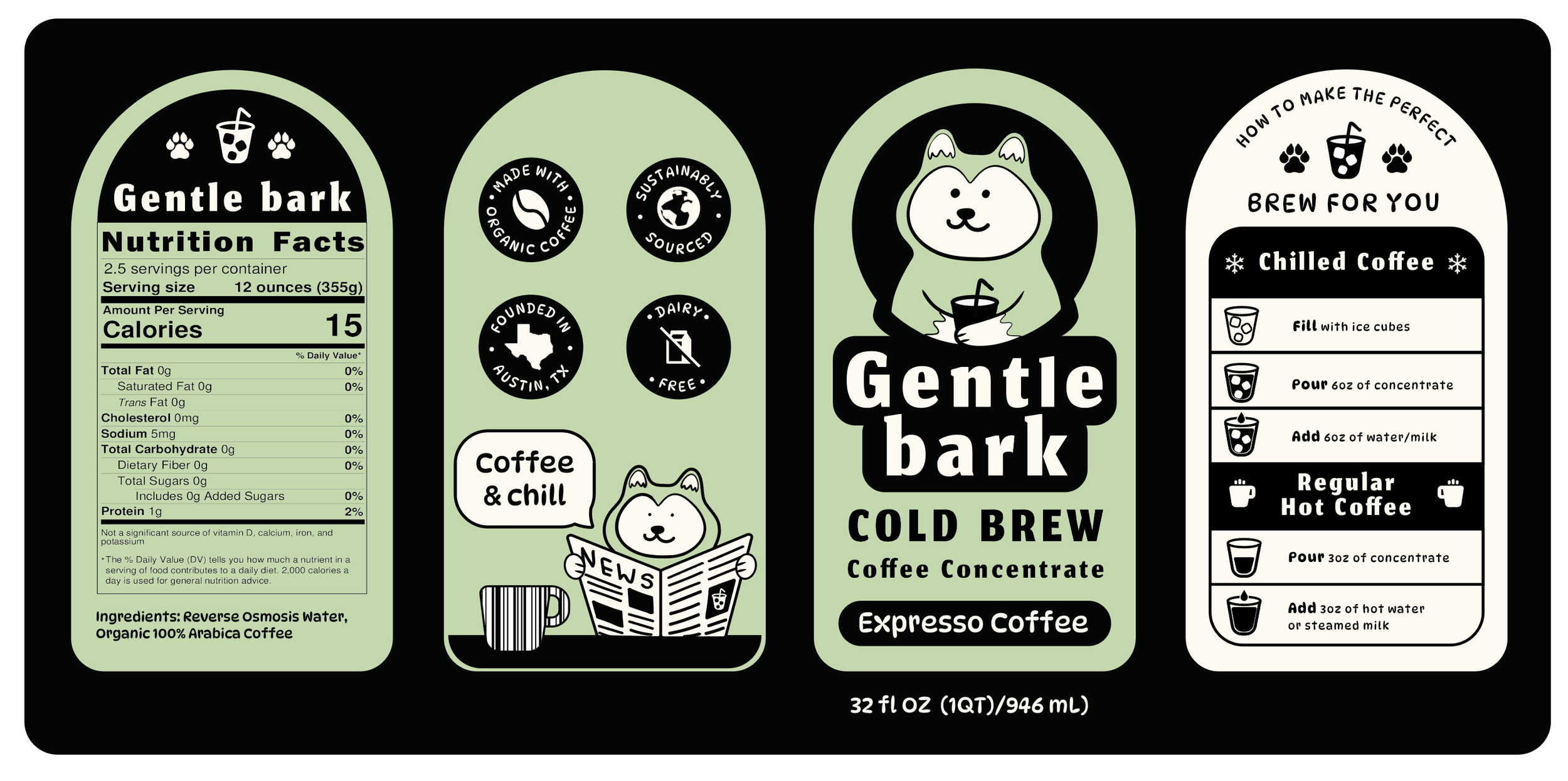
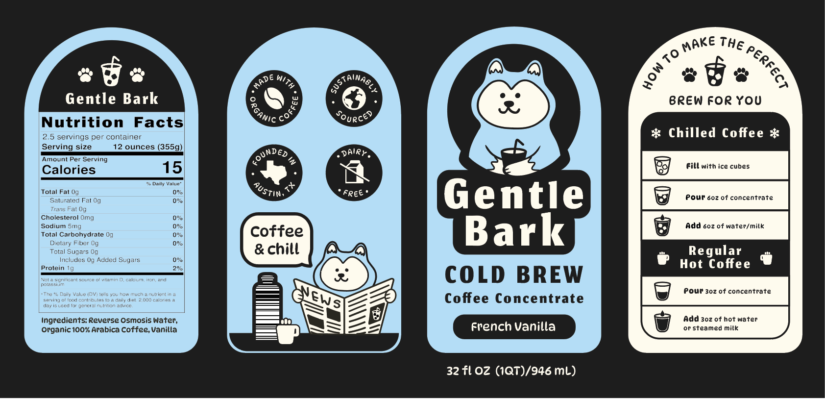
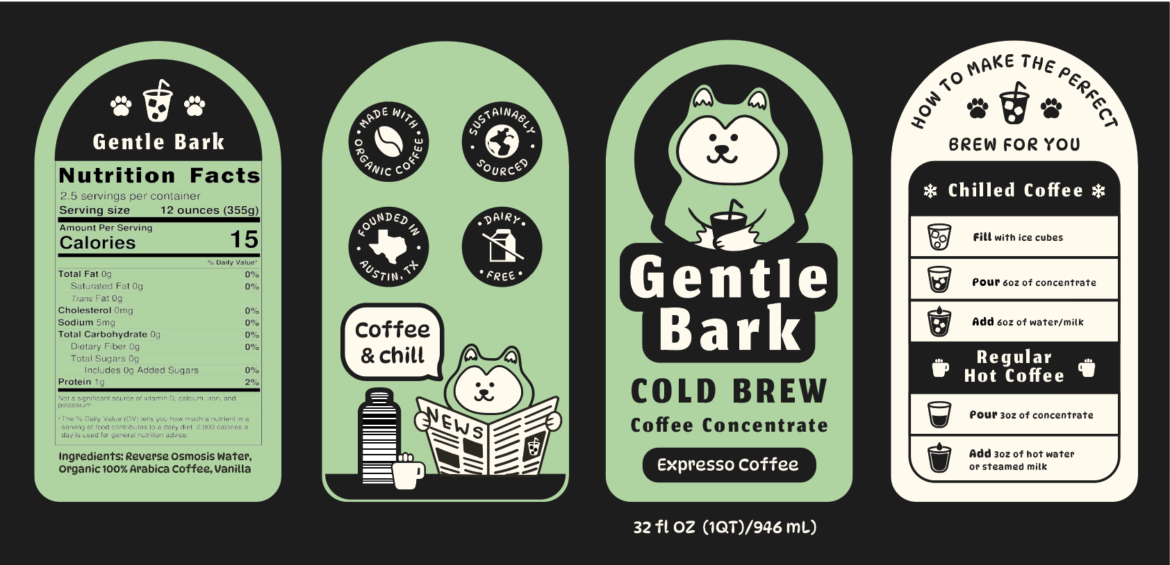
The updated bottle label for Gentle Bark reflects thoughtful refinements made in response to feedback, with a focus on improving visibility. A more legible font was introduced to enhance readability, especially for key information.
A playful speech bubble was added to emphasize the brand’s friendly tone, while rounded shapes throughout the layout create a softer, more approachable look. These adjustments bring better visual balance and clarity to the label, while maintaining the calm, and inviting personality of the Gentle Bark brand.

Variation 1
Variation 2
Variation 3
Final Label Design
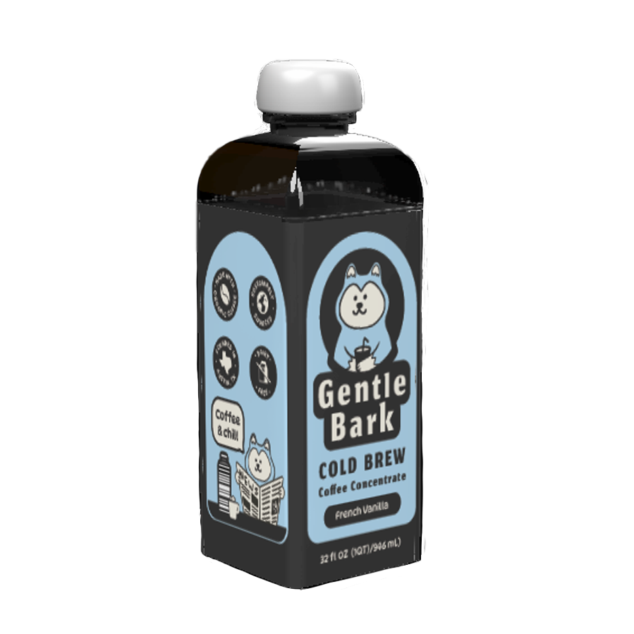
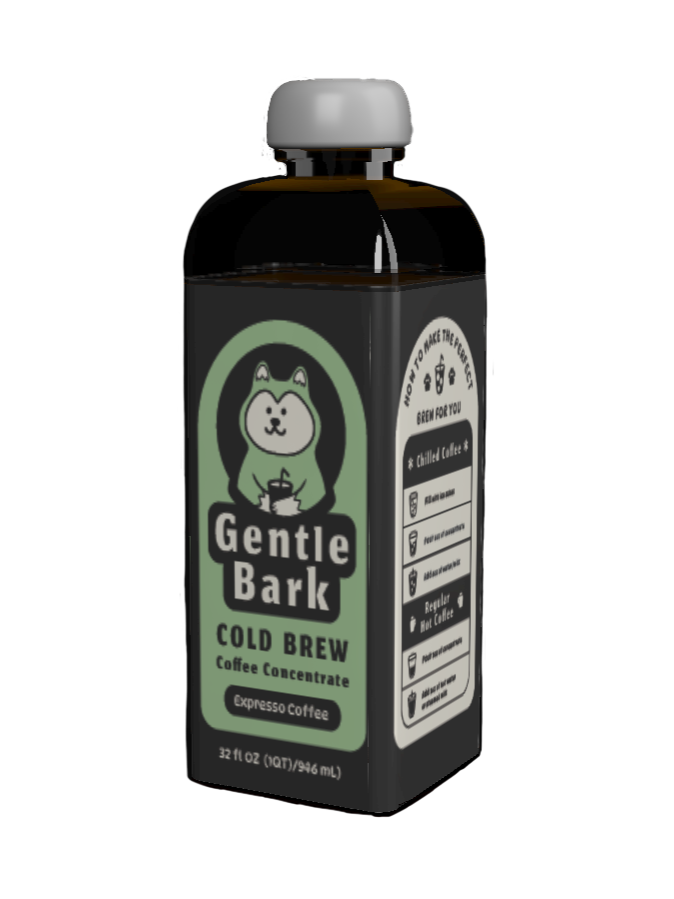
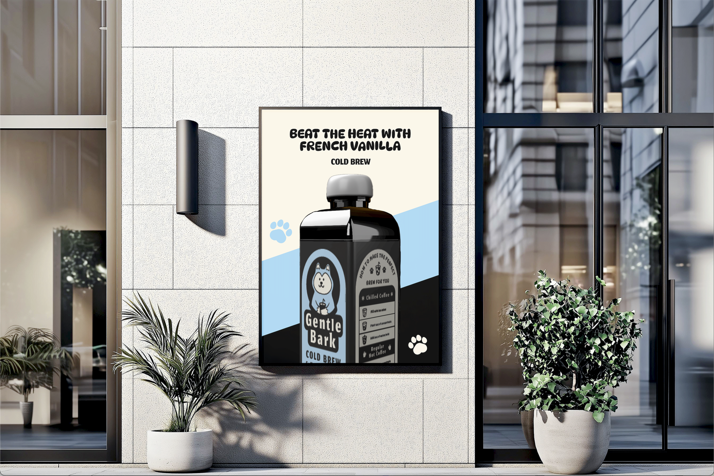
The final label design for Gentle Bark brings the brand’s personality to life by drawing directly from the calming, playful mood board developed early in the process. Soft pastel colors, gentle illustrations, and friendly typography all work together to reflect the brand’s approachable and comforting tone. Taking the design a step further, I used Adobe Dimension to create a custom 3D bottle—moving away from the standard cylindrical, medicine-like cold brew bottles commonly seen on the market.
This new form feels unique, inviting, and aligns more closely with the aesthetic and values of the brand. The 3D bottle was then seamlessly integrated into advertising materials such as posters and billboards, helping to create a cohesive visual identity across all touchpoints. To enhance the customer experience, I also developed additional packaging, including a convenient multi-pack option for those who want to enjoy Gentle Bark at home throughout the week.
Poster and Ads
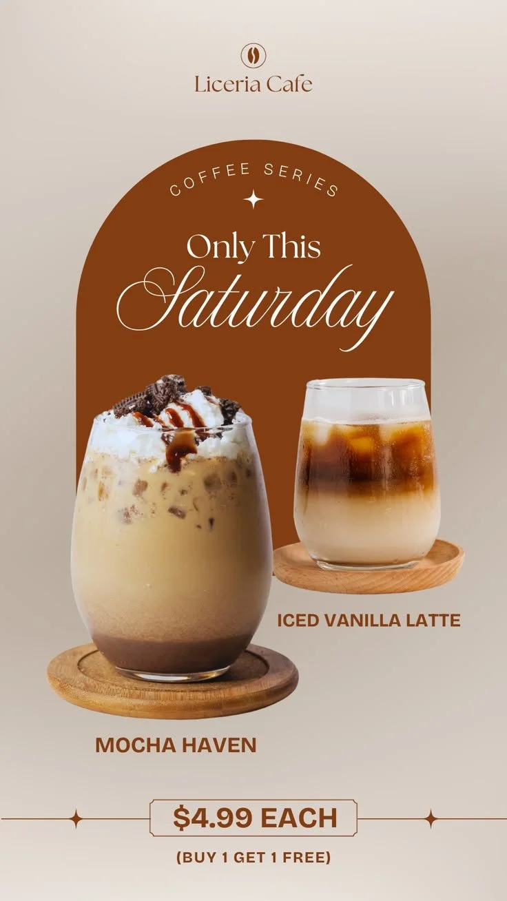
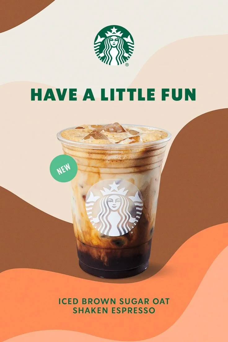
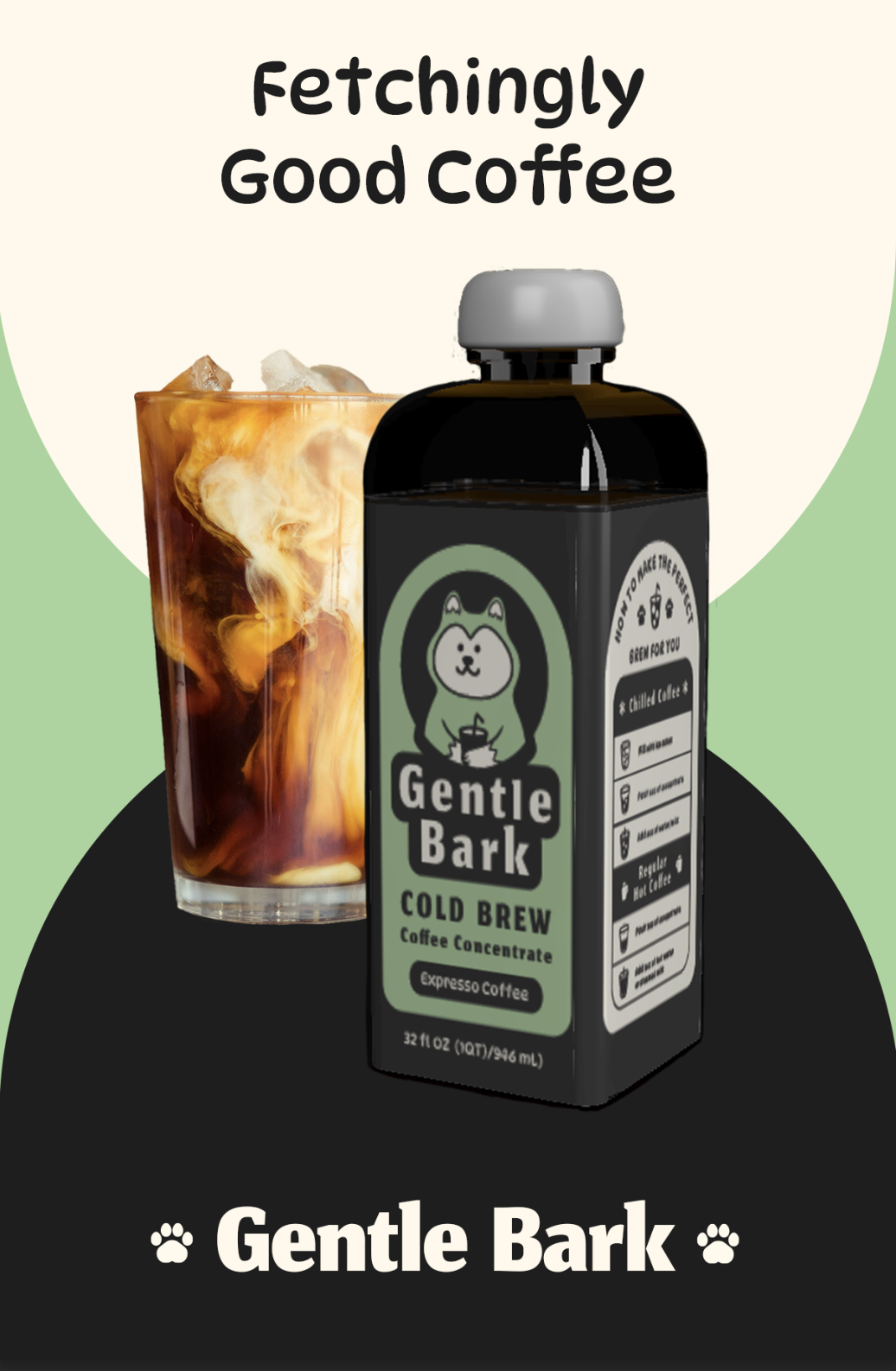
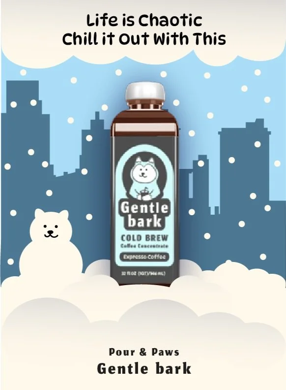
When I first began designing the poster ads for Gentle Bark, the visuals leaned heavily on illustration and didn’t clearly showcase the actual product. Realizing this, I took a step back and gave myself space to reset—literally. I went on walks, visited local coffee shops, and took time to observe how other brands presented their beverages in real-world settings. That change of pace helped brew new ideas and gave me fresh perspective. With a better understanding of effective composition and visuals, I redesigned the ads to clearly highlight the product, resulting in a stronger, more focused message that better connects with the target audience.
Old Poster Design

Updated Poster Design
Old Poster Design
Updated Poster Design
Mockups




Honestly, this was one of my favorite projects to work on. I really enjoyed the sketching and research process—it helped me understand what works and what could work even better for the brand. Designing the ads was definitely a challenge at times, but getting feedback and using it to solve problems made the outcome even more rewarding.
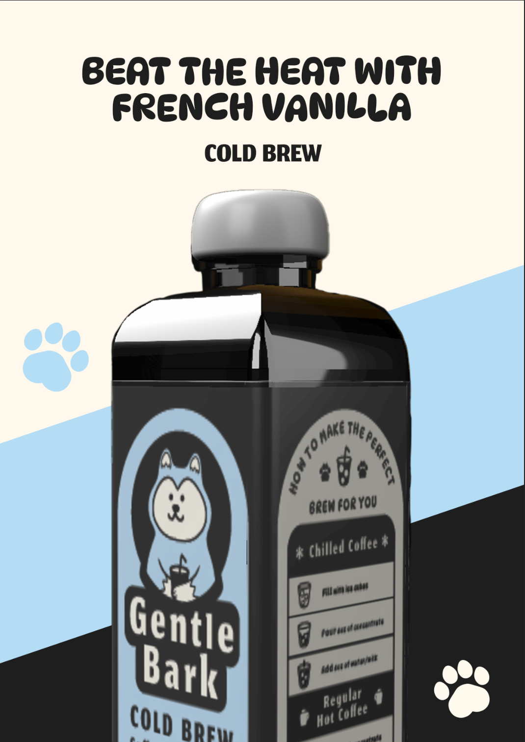
I especially loved creating the packaging for the French Vanilla flavor and developing the multi-pack. It gave me the chance to use more color while still keeping the brand instantly recognizable.