

Nature Valley Redesign
Nature Valley granola bars are a popular snack made with wholesome ingredients like oats, honey, nuts, and fruits. Known for their crunchy texture and natural flavor, these bars are often chosen by people looking for a convenient, on-the-go option that supports a healthier lifestyle.
Whether it’s for breakfast, a midday snack, or a quick energy boost, millions of people include Nature Valley bars in their daily routines.
-
Goal was to reimagine the Nature Valley brand by updating its packaging and website to reflect a fresher, more modern perspective. The goal was to maintain the brand’s natural, wholesome identity while making it more appealing to a new generation of consumers who value authenticity, wellness, and design.
-
Redesign the Nature Valley Box with gradients, and patterns to have a topographic feel to match the layout of mountains.
-
Redesign, Packaging, Website Design, Social Media, Content, Branded Merchandise, Campaign, Posters
-
The target audience is young adults who are confident in who they are and comfortable in their own skin. They enjoy exploring new interests, like reading or playing new games, or picking up old hobbies like disc golf. They value time outdoors, often walking their dogs.
While they still enjoy familiar snacks, they’re beginning to seek out better-quality options made with ingredients they can trust. Their lifestyle reflects a balance of tech-savvy leisure and a growing interest in personal wellness and mindful eating.
Discovery
This mood board captures the essence of Nature Valley’s connection to the outdoors and the journey toward better living. It features rich greens, earthy tones, and topographic elements that reflect natural landscapes and movement—symbolizing progress, growth, and exploration.
The imagery of forests, trees, and elevated textures creates a grounded, refreshing mood that complements the brand’s wholesome identity. These visual elements work together to inspire a packaging direction that feels both modern and rooted in nature.

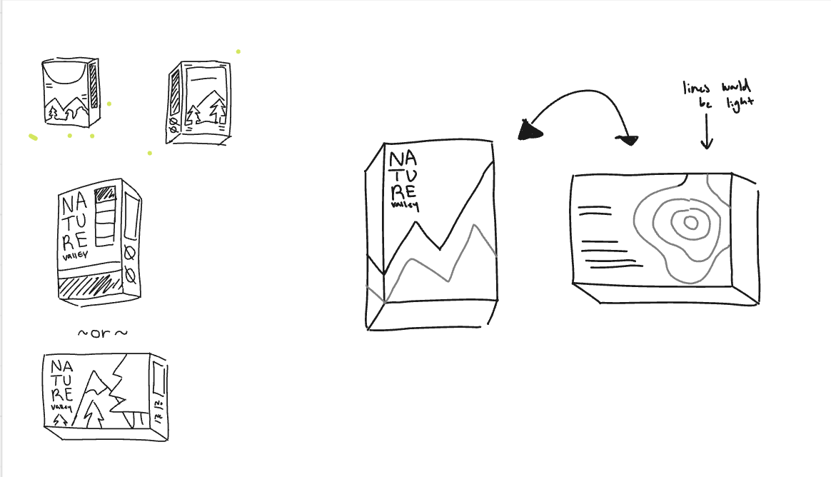
Sketch Process
In the initial sketching phase, I began by exploring a larger, rectangular box format based on the bigger Nature Valley packaging I had on hand. This helped me visualize space and layout more freely. Later, I transitioned to the standard-sized Nature Valley box to better align with the brand’s existing packaging and make the design more practical and relatable.
One of the key ideas in my sketches was incorporating trees along the sides of the box, wrapping around the edges to create a continuous, immersive nature scene. This concept emphasizes the brand’s outdoor roots while giving the packaging a dynamic and inviting presence from every angle.


Digital Drafts
The digital drafting process for this project was highly iterative. I went through several rounds of revisions—printing out each version, assessing how it looked physically, and making thoughtful changes based on both personal observations and feedback from others. With each round, the design became more focused and intentional. By the fourth version, I received valuable feedback suggesting the removal of the earthy brown tones and instead using solid, distinct colors for each panel of the box. This change helped create stronger visual contrast while allowing the topographic design elements I created to stand out and guide the viewer’s eye across the packaging.
Round 1


Round 2


Round 3


Round 4

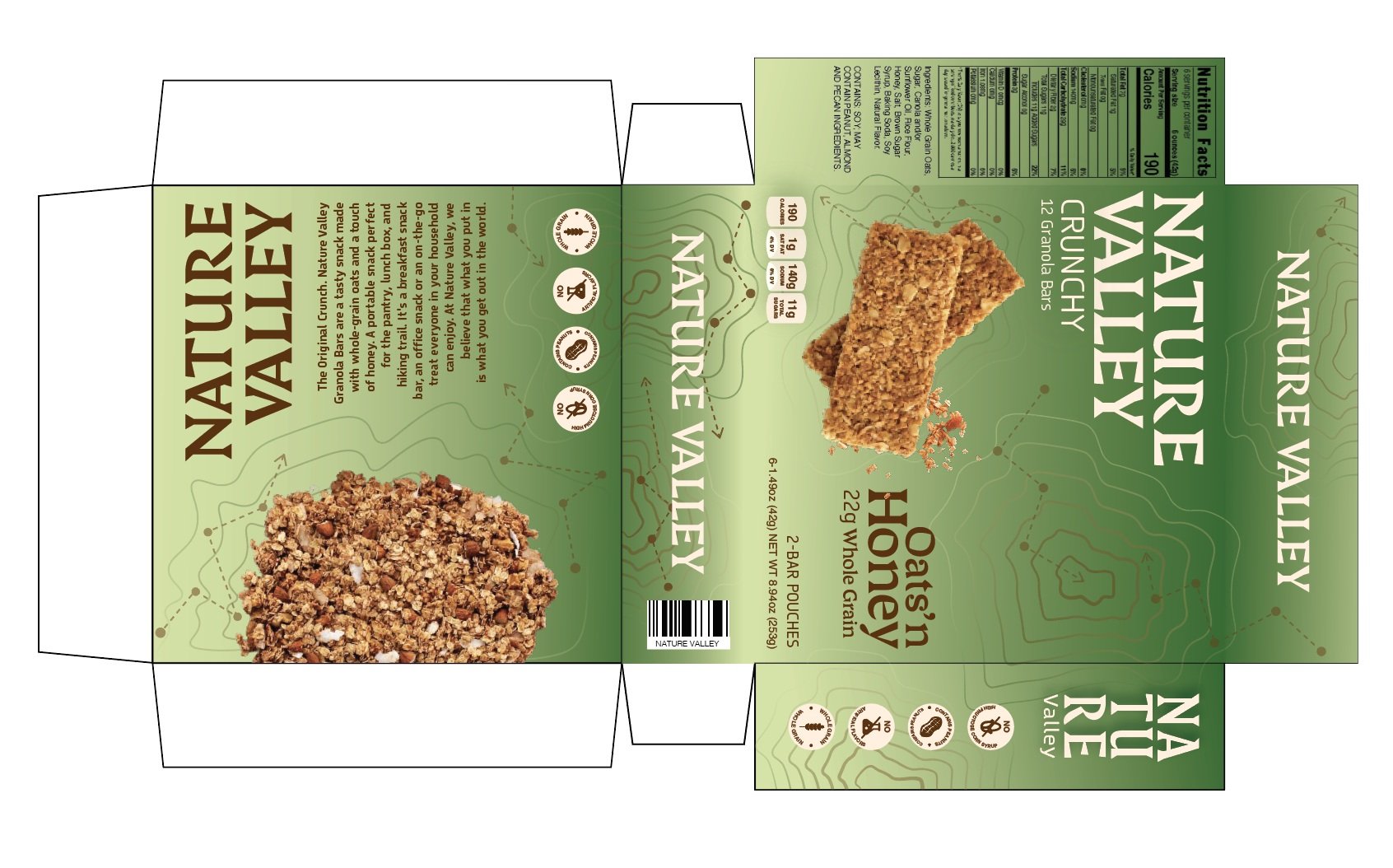


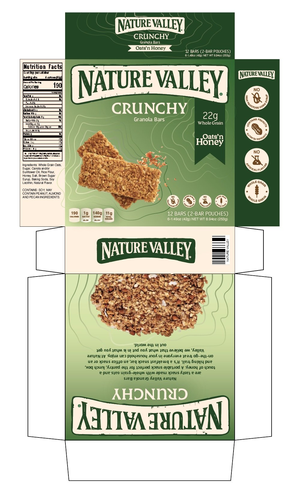
Final Package Design
The final design reflects a refreshed take on Nature Valley’s packaging, aimed at attracting a new wave of health-conscious consumers while honoring the brand’s legacy. Each panel of the box features solid colors in varying shades of green, used subtly to communicate freshness and a distinctly healthy feel. The custom topographic elements remain a key visual feature, adding texture and movement that draws the eye and reinforces the connection to nature.
Based on feedback, I reverted to the original Nature Valley logo, making only a slight adjustment to the color palette to harmonize with the updated design. This choice helps maintain brand recognition and trust, allowing existing customers to feel a sense of familiarity while presenting a modernized version that invites new audiences to connect with a product that’s always been there for them—now with a fresh perspective.

Original
Redesign
Website Design
The website redesign focuses on bringing clarity, freshness, and visual appeal to the Nature Valley digital experience. The original version featured earthy brown tones and dashed lines meant to represent walking trails, but the overall layout felt cluttered and lacked energy. In the updated design, I introduced a cleaner visual hierarchy that allows the photography to stand out and guide the user’s attention. A soft gradient of lighter to darker greens replaces the browns, giving the site a fresher, more inviting feel.
The topographic elements are still present, but now integrated more seamlessly to support the layout rather than overwhelm it. Altogether, the redesigned website better reflects the brand’s connection to nature while delivering a more engaging, user-friendly experience.
Old Website Design


Updated Website Design
Mockups


This project was a truly fulfilling experience that allowed me to explore a wide range of design skills—from packaging and web design to social media graphics and even custom wrapping paper. It felt rewarding to touch so many parts of the brand and create a cohesive visual system. One of the biggest challenges was definitely the beginning stages, where I struggled to find the right layout for the packaging.
But through trial, error, and continuous feedback, I was able to refine the design into something I felt proud of. In the end, the final outcome not only felt visually strong but also meaningful—offering a fresh take on a familiar brand that speaks directly to a new generation of consumers.