April Greiman:
Designed & Displayed
Booklet & Environmental Design
The Designer Who Changed My View
This project explores the groundbreaking work of April Greiman, a pioneering figure in graphic design known for embracing digital technology and pushing the boundaries of visual communication. Greiman played a major role in introducing the New Wave style to the United States and is celebrated for her experimental use of typography, layering, and digital tools at a time when many designers were still working strictly by hand.
To honor and introduce her legacy, I began by designing a booklet that highlights her career, design philosophy, and impact on the field. The booklet serves as both a visual and educational piece, offering readers insight into how she helped redefine what graphic design could be.
Building on this foundation, I expanded the project into a full exhibition design concept, creating mockups for posters, banners, and environmental graphics that showcase her aesthetic and influence in a physical space. This project not only allowed me to research and celebrate a design icon but also apply layout, branding, and exhibition design skills to communicate her story to a wider audience.
Challenge
The challenge is to explore and communicate the legacy of April Greiman through a printed booklet and exhibition design materials, highlighting her role as a digital design pioneer and her influence on contemporary visual communication.
Target Audience
This project is aimed at young graphic design students who are interested in learning about the evolution of design, particularly the transition into digital practices. It serves as an educational and visual introduction to April Greiman’s groundbreaking work and the design movements of her time.
Key Message
April Greiman’s fearless embrace of digital tools and experimental design reshaped the visual language of graphic design—and her story continues to inspire a new generation of designers to break boundaries and redefine the medium.
Research
Initially, I didn’t know who April Greiman was—but I had seen her work online. Her bold, layered compositions and experimental typography stood out to me, even though I couldn’t yet connect a name or face to them. And so, my curiosity lead me to learn more, I began researching her and quickly realized just how significant her contributions are to the history of graphic design.
She was one of the first designers to fully embrace digital tools in the 1980s, Greiman helped shift the entire field into a new era. Her approach challenged the norms of modernist design and opened the door to new visual languages rooted in technology, intuition, and experimentation. Learning about her journey gave me a sense of hope—it reminded me that design is constantly evolving, and that taking risks can lead to real breakthroughs.
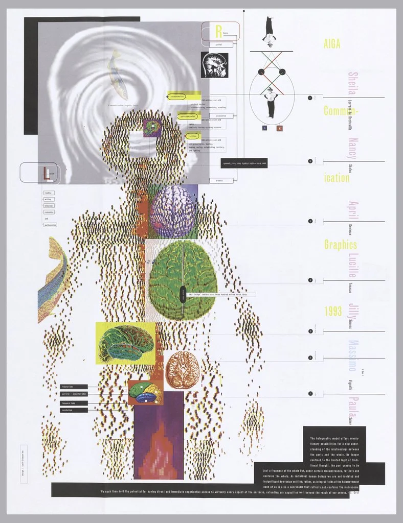
Through my research, I discovered pieces like "Does It Make Sense?" and "Mind and Body", which helped me better understand her vision and the philosophical depth behind her work. These pieces became key references in shaping my own visual direction for this project.


Discovery
The mood board draws inspiration directly from April Greiman’s iconic design style, featuring a collection of her artwork alongside vibrant 1980s visuals. I focused on bold colors, layered photography, geometric patterns, and expressive typography—key elements that defined her approach.
These references helped set the tone for my own design direction, capturing the spirit of experimentation, digital influence, and dynamic composition that Greiman is known for.

Sketch Process
During the sketching phase, I explored several concepts for the booklet cover and the overall visual tone of the project. I knew early on that I wanted April Greiman herself—or the iconic Macintosh computer—to be featured as a focal point. These early sketches helped me test different compositions and styles to find the right balance between homage and personal interpretation.
In the end, I chose to use an edited image of April Greiman for the cover, emphasizing her identity as the woman who helped transform the world of graphic design. I also created initial sketches for posters and banners, which guided the development of the exhibition visuals later in the project.


Cover Drafts
The updated bottle label for Gentle Bark reflects thoughtful refinements made in response to feedback, with a focus on improving visibility. A more legible font was introduced to enhance readability, especially for key information. A playful speech bubble was added to emphasize the brand’s friendly tone, while rounded shapes throughout the layout create a softer, more approachable look. These adjustments bring better visual balance and clarity to the label, while maintaining the calm, and inviting personality of the Gentle Bark brand.

Variation 1

Variation 2

Variation 3
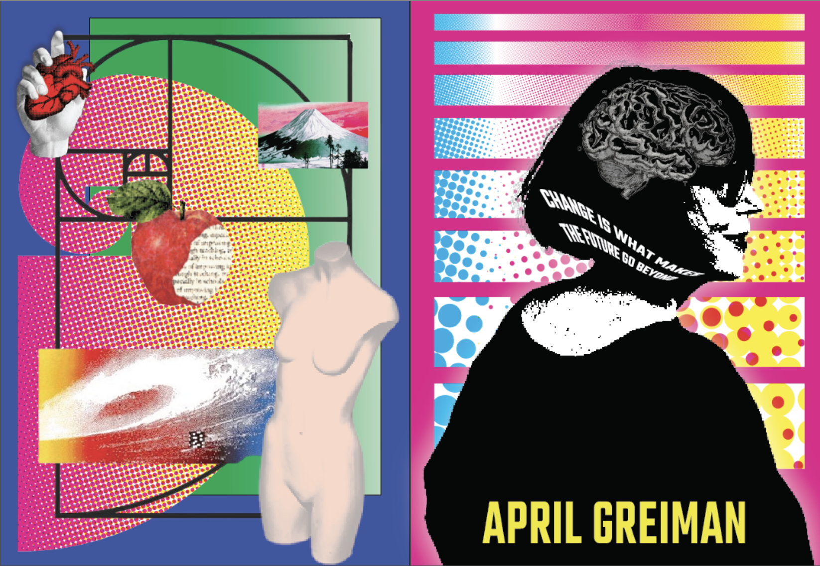
Final Cover Design
As I worked on the final cover design, I revisited what initially drew me to April Greiman’s work—and something clicked. Beyond the bold visuals and digital experimentation, what truly stood out to me was the sense of humanity in her designs. That realization became the foundation for my own approach.
To reflect that feeling, I incorporated the golden ratio to bring a sense of balance and harmony, while selecting assets that symbolize freedom, creativity, and learning. Since this project is also educational, I added elements like apples, pencils, and other school-related imagery, blending them with abstract and digital motifs inspired by Greiman’s style. The final cover features an edited image of April Greiman herself, placing her at the center of the narrative—as the trailblazer who reshaped the world of graphic design.

Booklet Design
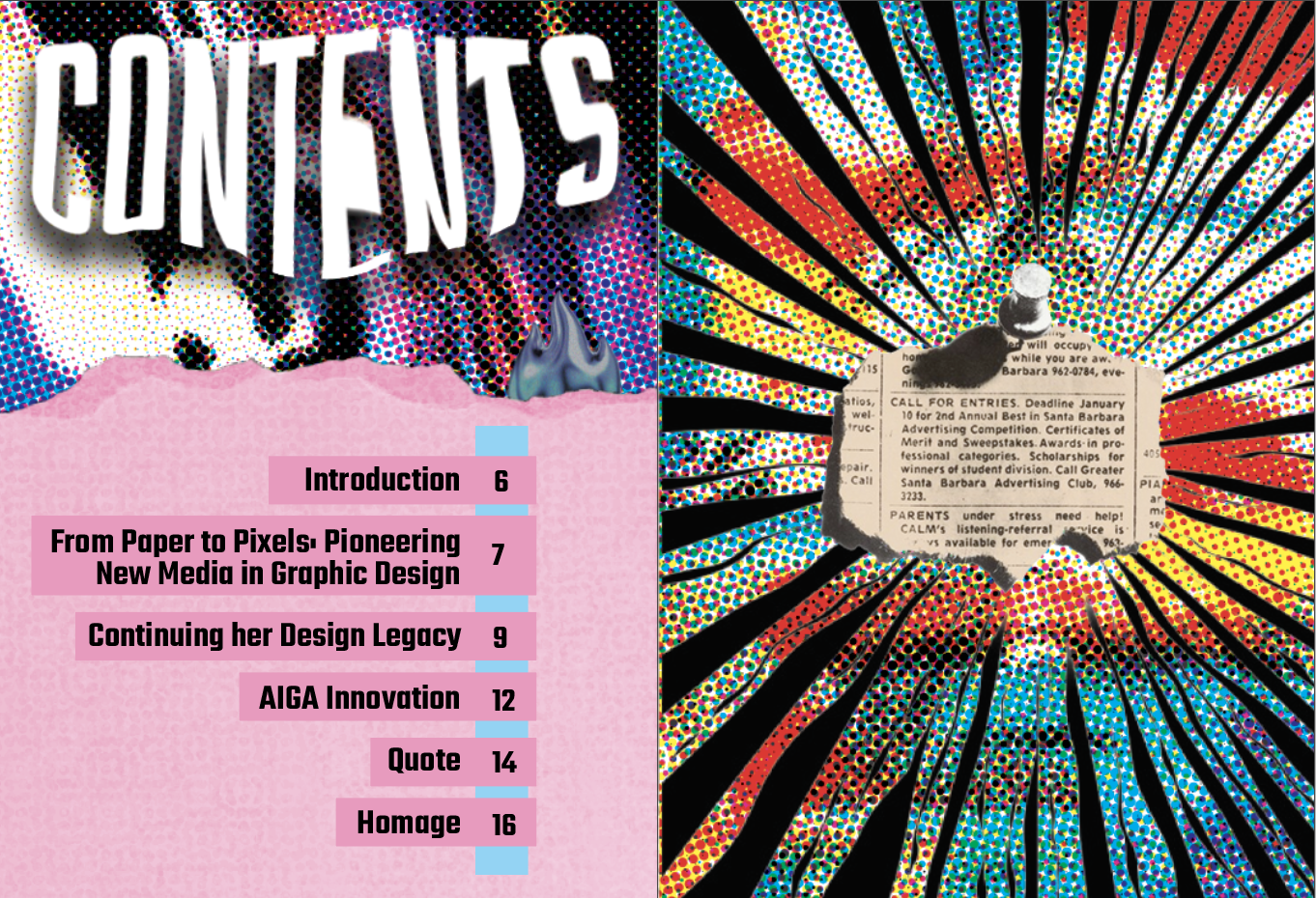
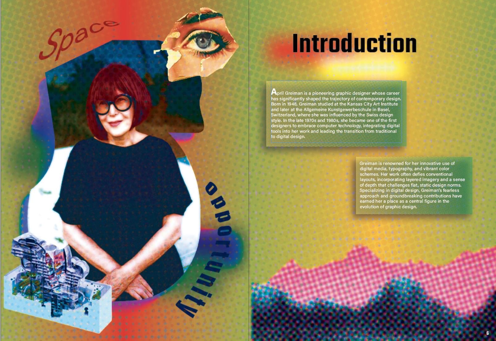
The same care and intention I put into the cover carried through to the rest of the booklet. Each page was thoughtfully designed, with assets that took time to research, select, and refine. Many pages took a full day—or more—to complete, as I focused on capturing the balance between informative content and visual storytelling. I wanted every layout to feel like a nod to April Greiman’s bold and experimental style, while still reflecting my own creative voice.
Toward the end of the booklet, I created a dedicated homage page, designed to closely emulate her aesthetic. This final section blends layered elements, dynamic composition, and personal symbolism, serving both as a tribute and as a culmination of everything I learned throughout the project.


Mockups


Working on this project was both a deep learning experience and a creative challenge. I found a lot of joy in researching April Greiman—someone I hadn’t known much about at first, but grew to admire deeply. Getting to understand her work and impact made the design process more meaningful. Creating the booklet gave me a space to not only practice my design skills, but also to connect personally with it.
One of the toughest parts was creating the collage-style visuals. Finding the right assets took time and patience, but seeing it all come together made it worth the effort. What I especially loved was translating the booklet’s design into larger-scale pieces like posters and banners. The idea of seeing a design I helped create come to life in a real, physical space—that would be a dream come true.
