

Mexico City
Travel Agency
Logo, Brand Identity, Print, Web Layout
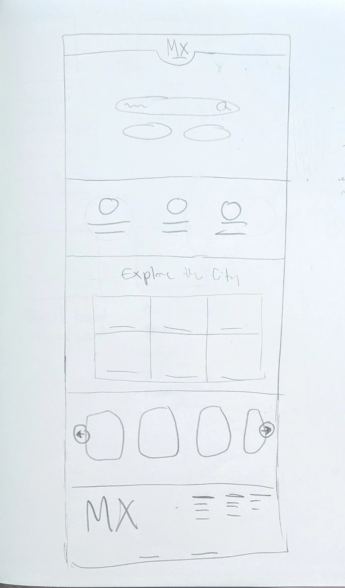
Find Your Destination Here!
This project introduces a travel agency concept designed to connect people from around the world to Mexico City's rich culture and history. Through vibrant visuals and engaging storytelling, the goal was to celebrate the city's rich history, colorful traditions, and welcoming spirit. The agency aims to make authentic experiences accessible, and create the feeling of both exciting and authentic, making it easier for families to immerse themselves in local culture, explore historic landmarks, and build lasting memories.
Challenge
The challenge for the project was to craft a logo along side an identity for the brand. Once that’s established, I created a brochure by using the vibrant color palette and mixing adventurous and historical photography and developed a website for customers to plan their next trip right away!
Target Audience
The target audience are for international families that seek meaningful and immersive travel experiences. These families who value cultural exploration, education, and authentic connections over traditional tourist activities. The agency appeals to parents planning memorable trips for their children that can bring the family together through experience.
Key Message
Bringing families closer to the heart of Mexico City — where history, culture, and unforgettable experiences await.
Discovery
The mood board focuses heavily on Mexican culture, traditional patterns, and vibrant colors. It draws inspiration from Mexico’s rich Mesoamerican roots, incorporating traditional motifs and ancient artistic styles.
Vibrant, lively colors — commonly associated with Mexican art and architecture — are used to capture the spirit and energy of the culture.
By blending historical influences with bold, modern visuals, the mood board is designed to attract families and travelers eager to experience the rich history, traditions, and life that Mexico City has to offer.

Sketch Process
The sketching phase explored a variety of concepts rooted in Mexico City’s cultural and historical identity. Early ideas included visual elements such as the eagle, temples, and other significant symbols. As the process evolved, there was a shift toward experimenting with typography — writing "Mexico City" in different formats and gradually merging pictorial elements with letterforms to create a unified design language.
A major influence during this stage was the memory of traveling to Mexico and observing the frequent use of the Mayan "Nahui Ollin" eye symbol in museums and historical sites. This symbol inspired a deeper integration of ancient iconography into the sketches, connecting modern visual identity with Mexico City's rich Mesoamerican heritage.


Digital Drafts
The digital phase focused on refining ideas from the sketch process and exploring how to combine typography with cultural symbols. Inspired by the mood board, a serif wordmark was developed and transformed using Mesoamerican patterns and the Nahui Ollin eye symbol. This approach created a logo that feels both authentic and rooted in the history of Mexico City.


Final Logo Design
The final logo is a refined blend of modern typography and Mesoamerican-inspired design. Building upon earlier drafts, subtle adjustments were made to improve clarity and balance while preserving the cultural essence of the concept.
The use of serif letterforms combined with traditionally inspired motifs — including the Nahui Ollin eye — adds a meaningful layer that ties the identity back to the city’s roots. The result is a bold, culturally grounded logo that reflects the richness, history, and spirit of Mexico City.
Print Design
The brochure design was updated to better reflect the brand and improve readability. The original layout was heavily saturated and featured text placed over complex backgrounds, which made key information difficult to see. In the redesign, a white background was introduced to create a cleaner, more open feel and enhance legibility. Real photographs were used to connect viewers more authentically to the culture and atmosphere of Mexico City.
Using a map for viewers to see the sites close proximity to each other. The green color, which was previously overused, was refined to appear only in the icons — creating consistency between the brochure and the website while guiding the viewer’s attention more effectively.
Backside Design (Round 1)

Front Design (Round 1)

Backside Design (Round 2)

Front Design (Round 2)

Backside Design (Round 3)

Front Design (Round 3)

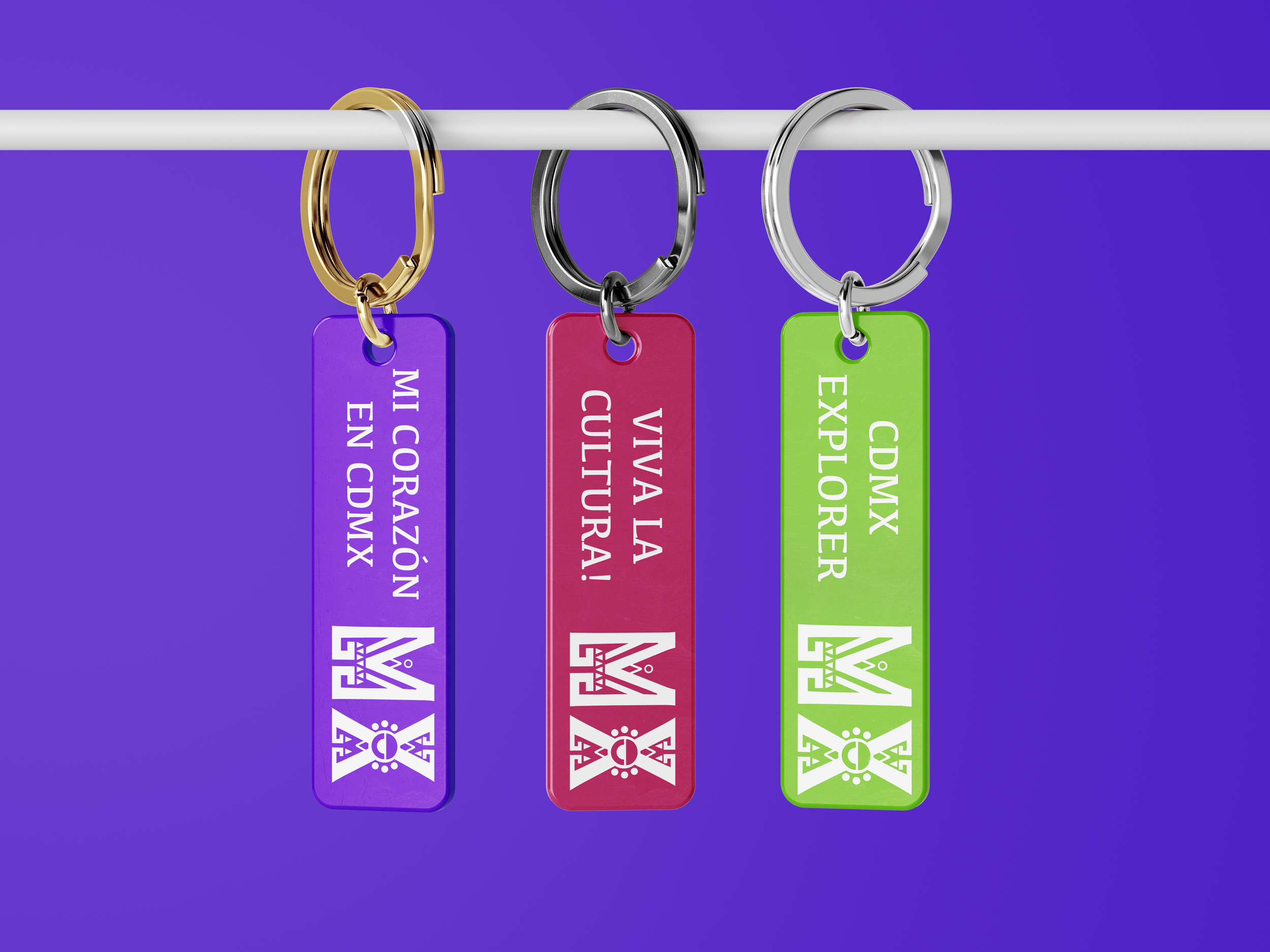
Mockups


This project holds a special place in my heart, as it allowed me to connect personal memories and cultural identity with the design process. Creating a brand rooted in the history and vibrancy of Mexico City gave me the chance to incorporate something deeply meaningful into my work.
Exploring the logo development was especially rewarding, as I translated those ideas into a visual identity. Working with print was a new challenge for me, but one that pushed me to grow — and overcoming it made the final result even more fulfilling. I’m excited to keep learning and expanding my skills through future projects.